
While I could generate a pretty long list of complaints about the construction of many Cuban cigars, I rarely find fault with Habanos S.A.’s approach to packaging. With few exceptions, the designs Habanos S.A. uses are incredibly well done, to the point where it’s oftentimes on a different level compared to other cigar companies. Some of that, undoubtedly, has to do with the rich artistic histories of the brand it sells, but the Hoyo de Monterrey Primaveras shows that it’s not just about reusing images created a century ago.
Over the last few years, roughly a half dozen different companies have followed Davidoff’s lead in creating cigars named after the Chinese Zodiac calendar, none more notable than Habanos S.A.
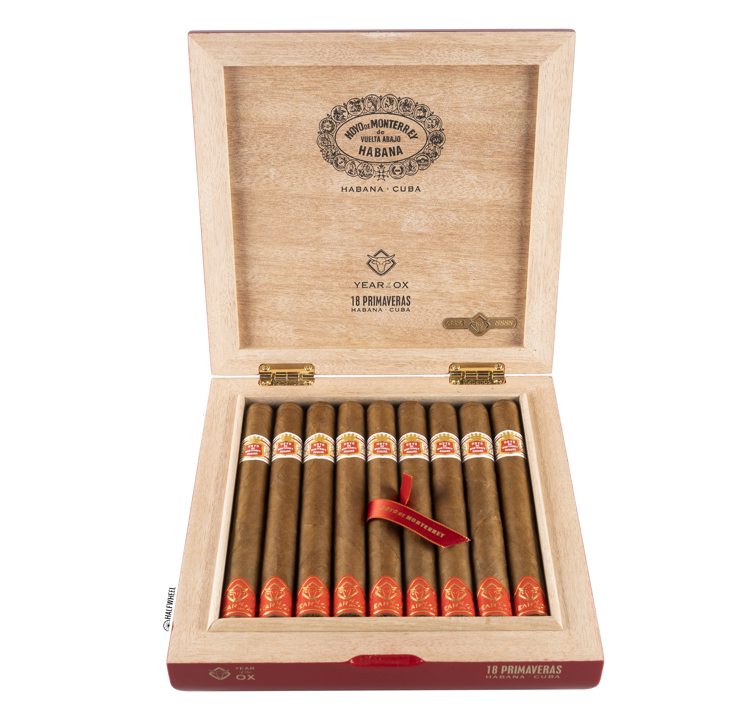
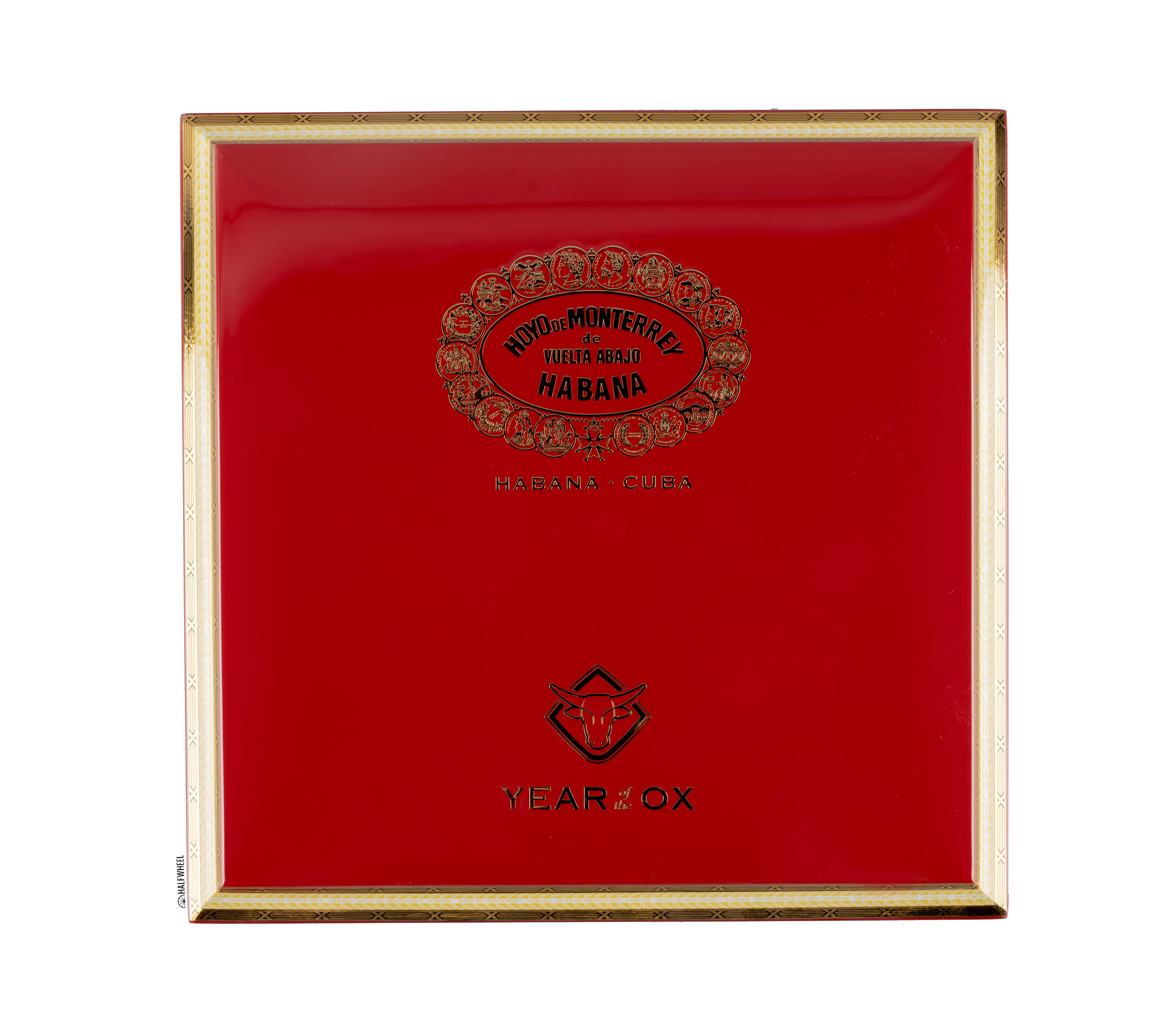
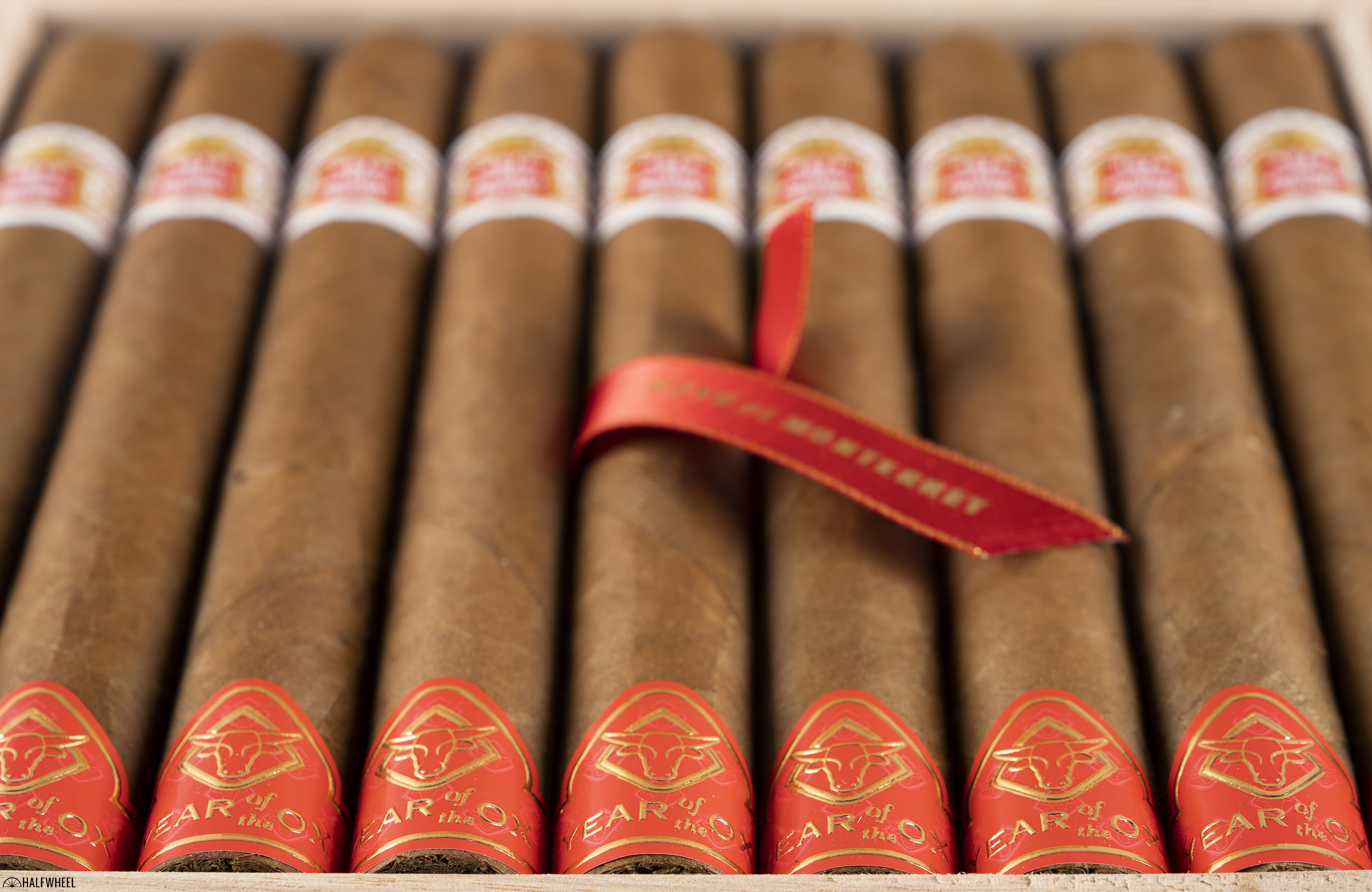
The secondary band alone shows off how good the company is at understanding all the little things that make great packaging: font choices, spacing, powerful icons. But the real star of the show, in my opinion, is the high-gloss red box and the accompanying gold accents; it’s pretty simple, and yet, I can’t stop staring at it.
This is not the best overall packaging design of the year—it’s in 10th for a reason—but it’s difficult to find what else Habanos S.A. could do to improve this design or the execution of those designs on the product itself. — Charlie Minato.