After somewhat of an absence last year, a tradition Brooks started at SmokingStogie is back, packaging awards. As the amount of releases continues to increase annually, the diversity in packaging continues to increase. Not all of it is great, but in general, it seems fair to suggest the innovation within the concept of packaging a cigar is at its highest point. At the very least, the effort being put into packaging leads us to believe rewarding the best examples is applicable.
THE PROCESS
All four of halfwheel’s writers participated in the creation of the list. We rated the entirety of a cigar’s packaging: bands, boxes, etc. The tobacco product itself was not judged, simply the packaging used for presentation. Each one of us blindly submitted twelve unranked nominations consisting of new packaging. After the unranked lists were submitted, each writer ranked their top 12 packaging based on the pool created by the prior submissions. The top 10, based off a compilation of each of the four lists, is published below.
ELIGIBILITY
- All items must be new. Excluded were concepts that had been minimally tweaked or simply reintroduced as part of line extensions. For clarification, concepts like Viaje’s Zombie packaging were excluded because it was simply an update. Similarly, Drew Estate’s packaging for Ratzilla was excluded because the packaging was simply a modified version of its UF-4 packaging, which debuted in 2011.
- Anything not available for retail purchase was excluded. This means Tatuaje S&S’s packaging and Habanos S.A.’s festival items were excluded. Single store releases were accepted.
- Eligible packaging items must have been released in 2012. For example, Oliveros’ SoBe Humidor, which is expected to ship next week, was not eligible.
THE TOP 10
1. VIAJE SUPER SHOT
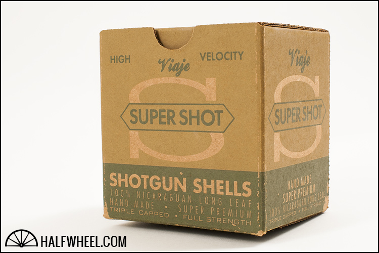
A nod to his newly discovered hobby of clay shooting, Andre Farkas created the Viaje Super Shot as a shorter cigar that he could enjoy between rounds, giving the packaging the full treatment in the process. A cardboard box that abandons Viaje’s standard logo and font, it seems more at home on an ammo shelf at a sporting good store than it is in a cigar humidor. The photo in Charlie’s review of the Super Shot 10 Gauge shows just how close the box is to shotgun shell boxes from earlier eras. Its great printing quality and an attention to detail caught all of our eyes, ranking no lower than fourth on anyone’s list, and thus earning the Viaje Super Shot the top spot in this year’s Packaging Awards. — Patrick Lagreid. 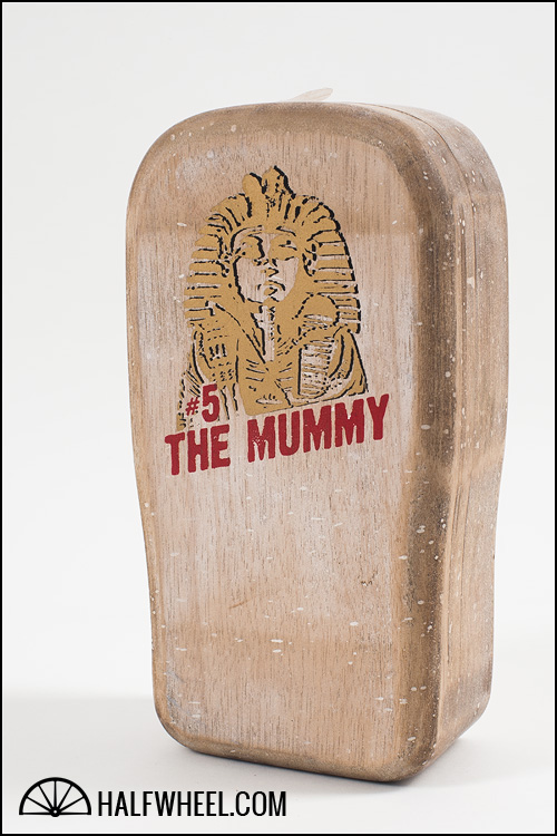
2. TATUAJE THE MUMMY
While the Tatuaje Monster series always has unique and perfectly themed boxes to go along with the limited edition cigars The Mummy packaging has stepped it up a notch. The solid wood sarcophagus and the embossed pharaoh on the front ensured that not only would the packaging stand out among any other cigar but even among the Monster series itself. To top it all off a single cigar in the middle of the bundle of 13 was wrapped in white tissue paper to represent the very thing the cigar was named after—clever and impressive all at the same time. — Brian Burt. 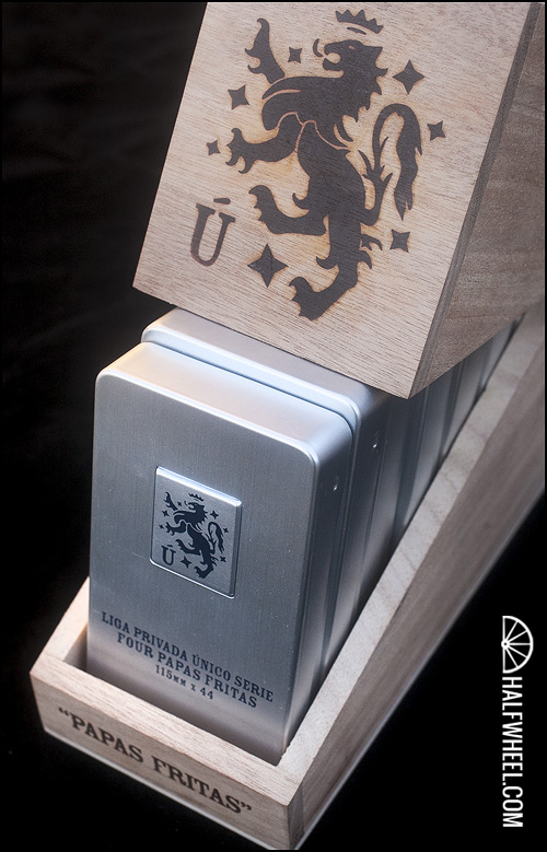
3. LIGA PRIVADA ÚNICO SERIE PAPAS FRITAS
When I first heard about how the Papas Fritas were going to be displayed, I have to admit, I was a bit taken aback. But that was before I actually saw it. Looking at the finished product, I absolutely love the distinct dichotomy between the highly reflective metal of the tins and the branded Liga Privada logo on the wood, which work extremely well together against all odds. The seven separate tins fit perfectly in their slot, leaning at just the right angle to show how many there are without showing more then it should. The perfect combination of new and old, metal and wood. All four of us had this on our lists. — Brooks Whittington 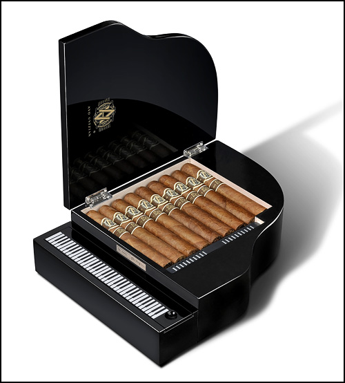
4. AVO 25TH ANNIVERSARY
Music has long played a role in the packaging of Avo Uvezian’s cigars, from CDs being included in boxes and song names being featured on secondary bands to the packaging for this year’s AVO 25th Anniversary. A highly lacquered box shaped as a piano had a lid that lifted up to reveal the cigars, with the keyboard lifting up to reveal a space to keep your accessories. The AVO 25th Anniversary box is one worth holding onto—an absolute beauty that captures Uvezian’s careers in music and cigars. — PL.
(Image via AVO/Davidoff)
5. ROOM101 OSOK 212
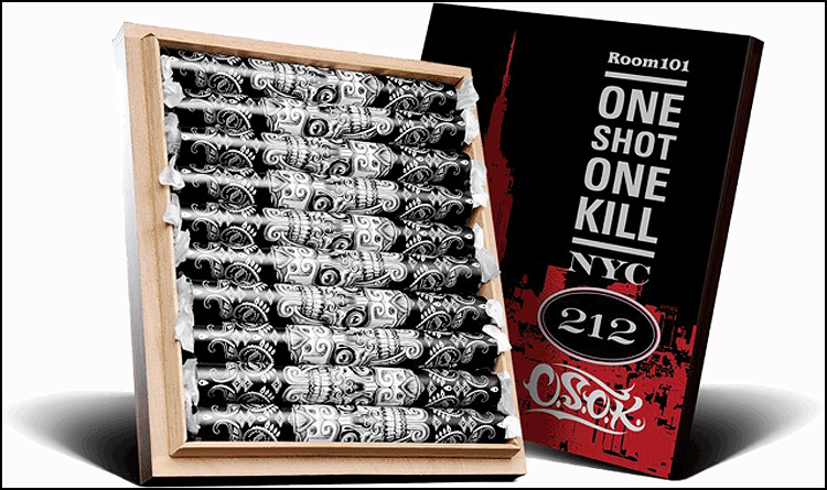
The regular Room101 OSOK probably could have ended up on the list. We loved the bold bands and individually wrapped cigars. But by the end of the year, Matt Booth’s creation for his friend Edgar “One Shot One Kill” Hoill went one step further. We aren’t sure how we feel about the secondary bands, but the specially created version for New York City’s Cigar Inn featured an update to the box that worked. There’s a lot going on with OSOK 212, but we love it. — CM.
(Image via Room101/Davidoff)
6. ROCKY PATEL HR 500
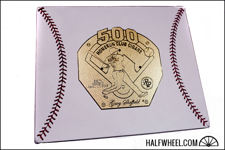
While the pictures of this box display at as impressive the real beauty lies in the feel. Wrapped in leather and stitched together to look like the curve of a baseball the box of the HR 500 looks and feels just like a baseball, save for the actual spherical shape. In the middle of the lid the gold placard looks very award-like making each box a trophy dedicated to Gary Sheffield’s accomplishment. — BB. 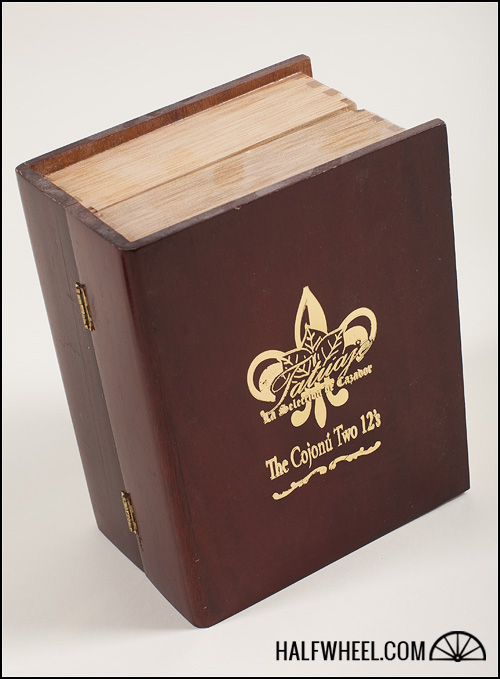
7. TATUAJE COJONU 2012 “THE BOOK”
I have always been impressed with the look of a book of cigars, from the first time I saw a Cuban example to the more recent, the Tatuaje Cojonu 2012. There is a different blend enclosed in each side of “The Book”: Connecticut Broadleaf on one side and Ecuadorian Sumatra on the other. The design of the book is simple, yet elegant; sharp, yet refined; functional, yet artistic. A great looking example of a wonderful concept. — BW.
8. FOUNDRY
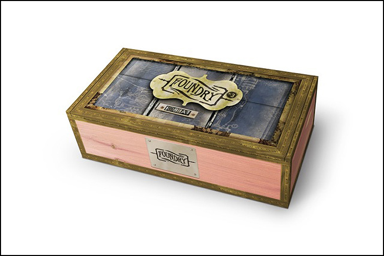
Launched at IPCPR 2012, Foundry is the creation of Michael Giannini, who also oversees La Gloria Cubana and has become a major creative force for the General Cigar portfolio. Giannini successfully captured the imagery of steampunk, which is broadly described as a form of science fiction that meshes the 19th Century British Victorian era with a post-apocalyptic future where steam power has come back into mainstream use. Intricate artwork on the box that draws in the imagery of the steam punk movement, a unique color scheme and a metal band shaped like a gear capping off the cigar’s presentation helped earn the Foundry a vote from all four of us. — PL.
(Image via General Cigar Co.)
9. VIVA REPUBLICA RAPTURE
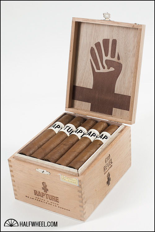
The definition of new school packaging, Jason Holly’s brand drew the ire of a few manufacturers, but the result is unique. The freshman release from the Pennsylvania retailer and Guillermo León is clean, fresh and crisp. At every turn, The Rapture delivers a fluid message and a flawless execution. More classic features are present as well: single bands, wooden boxes and great pressing. The Rapture is bold without being too much. Outside of the indications on the box, no one would think this originated at La Aurora. — CM. 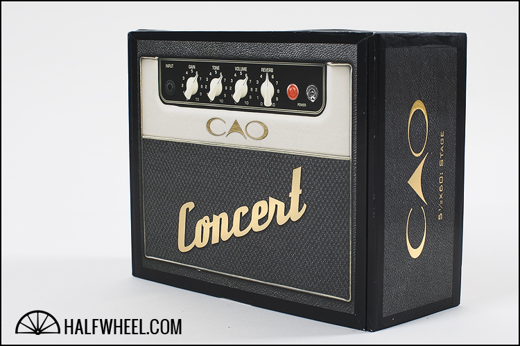
10. CAO CONCERT
CAO states the Concert series boxes were designed to look like a classic Marshall amplifier, of which they did a pretty good job of. It’s cool and fits in with the line’s name perfectly. The band is also fittingly shaped like a guitar pick which ties the whole theme together nicely. There were also some limited edition humidors that had built in speakers that took the whole amplifier idea to a whole new level, however, we felt the regular production boxes were good enough to stand on their own right. — BB.


