
There was nothing wrong with the original Davidoff Royal packaging, but it’s tough to compare it to the Royal Release.
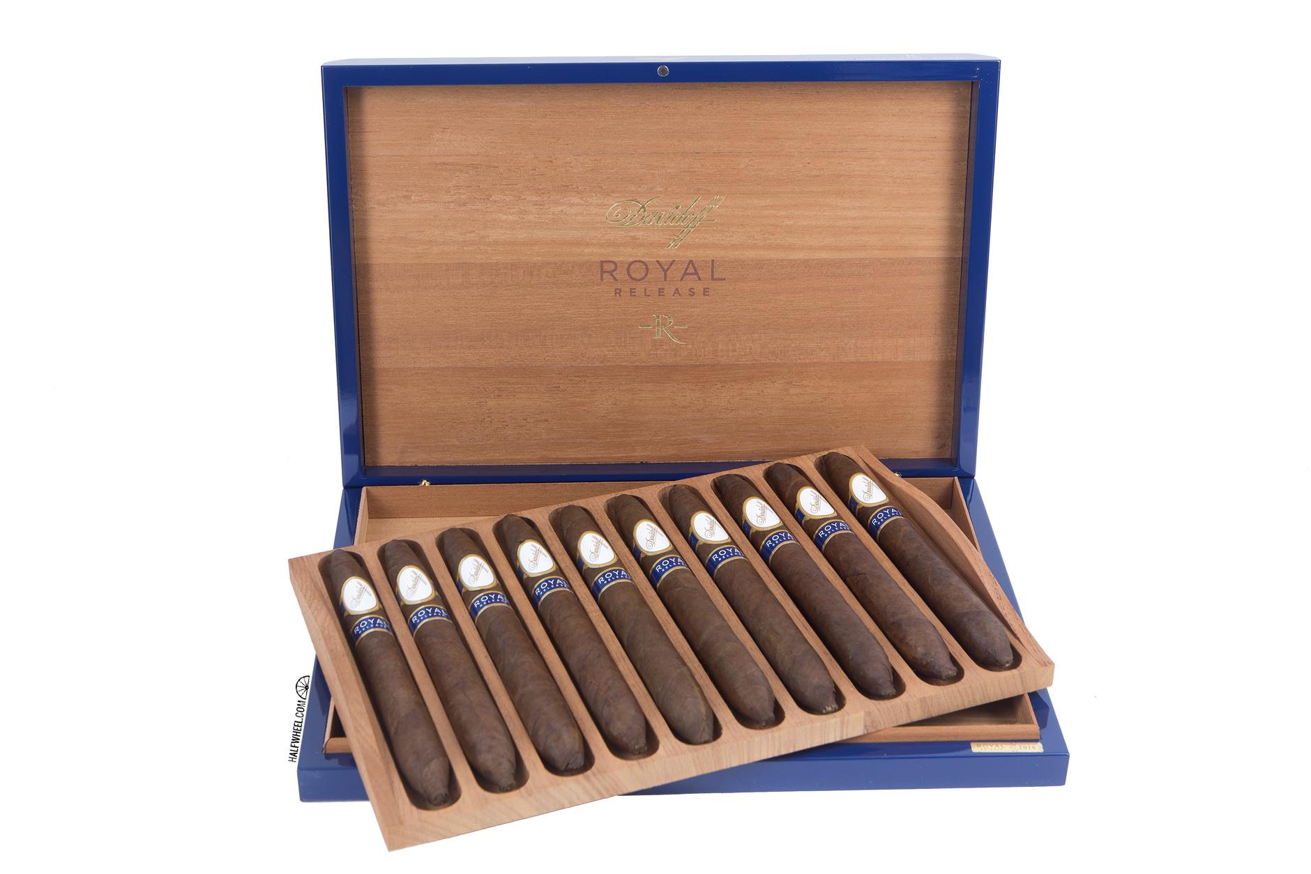 It’s in the same vein as much of Davidoff’s limited edition zodiac release, but instead of the color red, there’s a clear royal blue inspiration. As is often the case with Davidoff, the attention to detail is remarkable. Like the original release, the cigars are actually placed in the box in removable trays, there’s a protective cardboard box that is fairly striking in its own right and a card is included showing the rollers and supervisors.
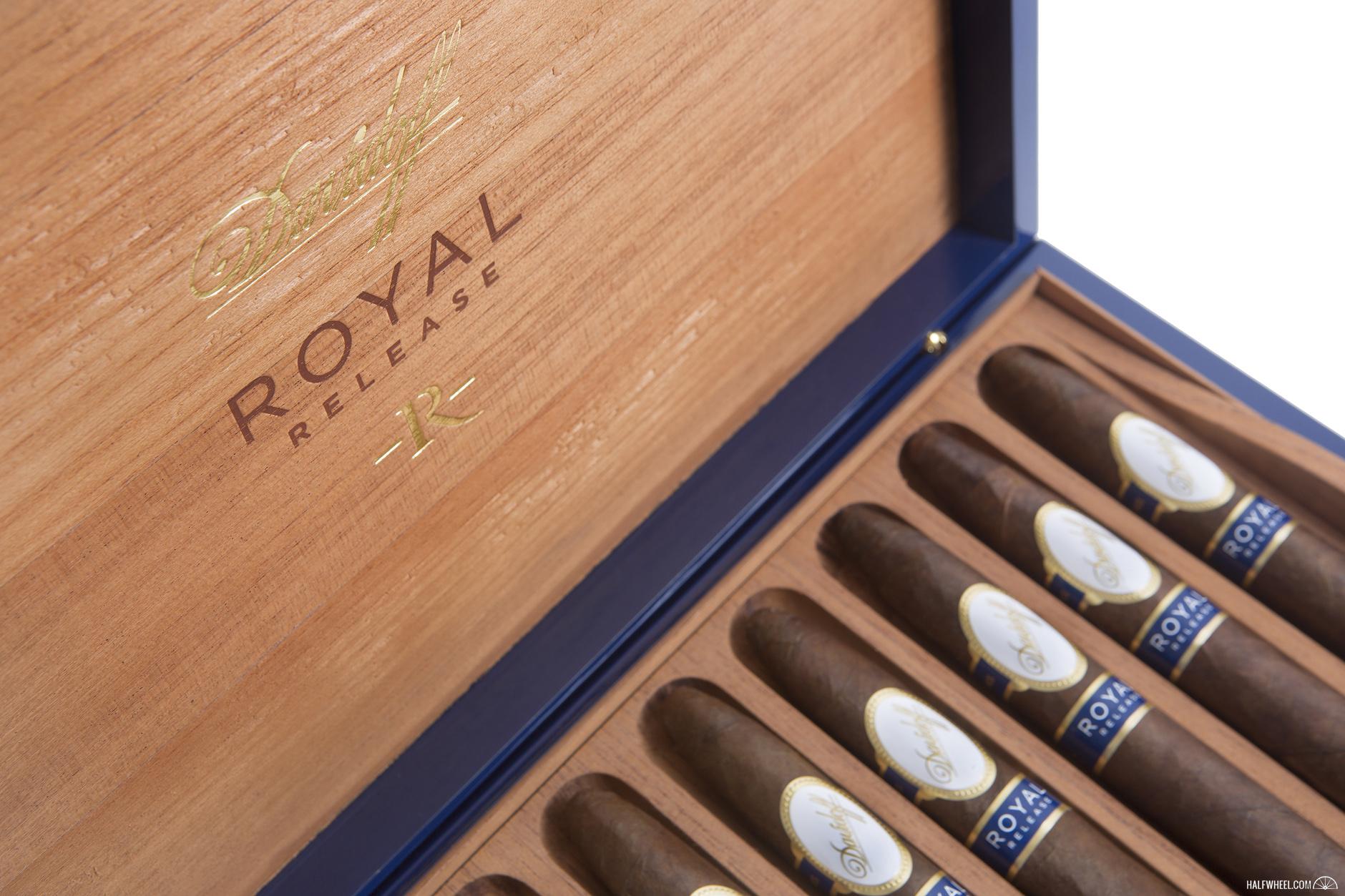
Perhaps more than anything else, Davidoff took what was arguably the biggest visual flaw with the original Royal cigars, the secondary bands, and found a solution that is fitting of the boxes.
Read the review here.