While you can definitely make the case that this was not the strongest crop of candidates for new brand of the year, the packaging in 2013 was oftentimes stellar. We judged based off both the containers the cigars came in, the bands and the overall design language. Entries were judged on originality, quality and execution.
Each of submitted up to 20 entries, the top 14 were then ranked by each of the four of us.
1. DAVIDOFF LIMITED EDITION 2014 YEAR OF THE HORSE

Year of the Horse or Year of Davidoff? As far as the packaging awards went, it might as well have been both. Sure, Camacho’s redesign garnered three places for its new design language, but Year of the Horse garnered all but one first place vote amongst our staff, the lone dissenter rated this third.
If Ferrari ever made a cigar box, it would probably look something like this, albeit a bit lighter shade, rosso corsa. When Brand Ambassador Jeff Stone showed the box in prototype form off at the 2013 IPCPR trade show, the only thought was, can they actually put it on the market like that? While they did. The thick high-gloss lacquer, split with black felt and gold lettering and the surrounding skeleton; nothing overly groundbreaking, but executed with precision that would put this simply out of reach for most cigar companies. And because an external latch would so obviously destroy the lines of the nine-count box, there’s a magnet.
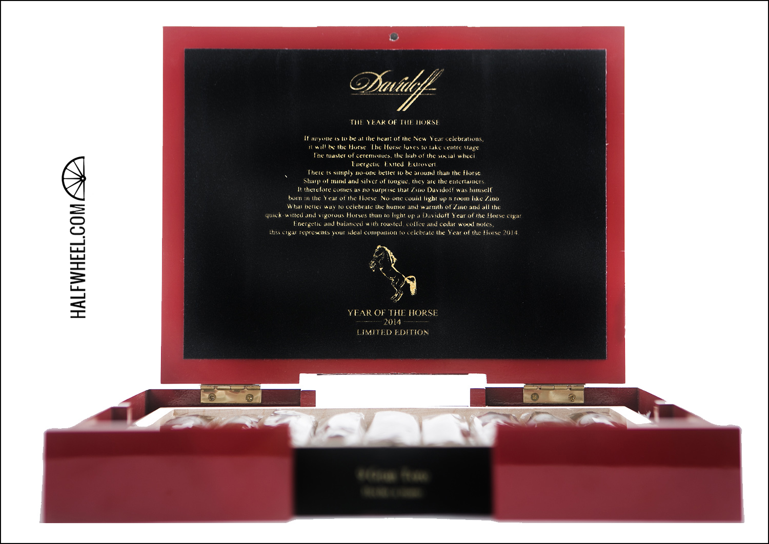
If that was not enough, the secondary bands turned out equally as meticulous. There were a lot of good designs from Oettinger Davidoff AG this year, including some other examples from Davidoff’s eponymous brand, none were quite on this level, because nothing else was quite on this level. — CM.
2. TATUAJE THE JV-13
Every year since 2008, Tatuaje has released a cigar for Halloween that commemorates a specific movie monster. Everything having to do with the release is inspired by the monster chosen, from the boxes, coffins, to the color of the bands and even the blend.
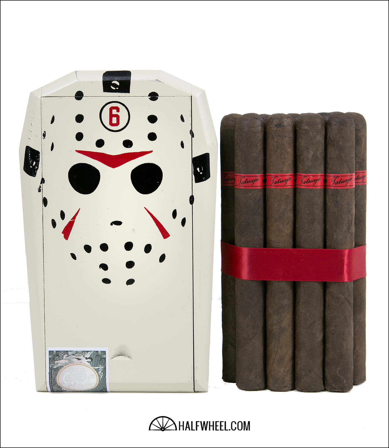
For 2013, Jason Voorhees of the Friday the 13th films was chosen, and the coffin the cigars come packaged in is arguably one of the best in the series. The coffin is an off white color and is painted to look almost exactly like Jason’s signature hockey mask.
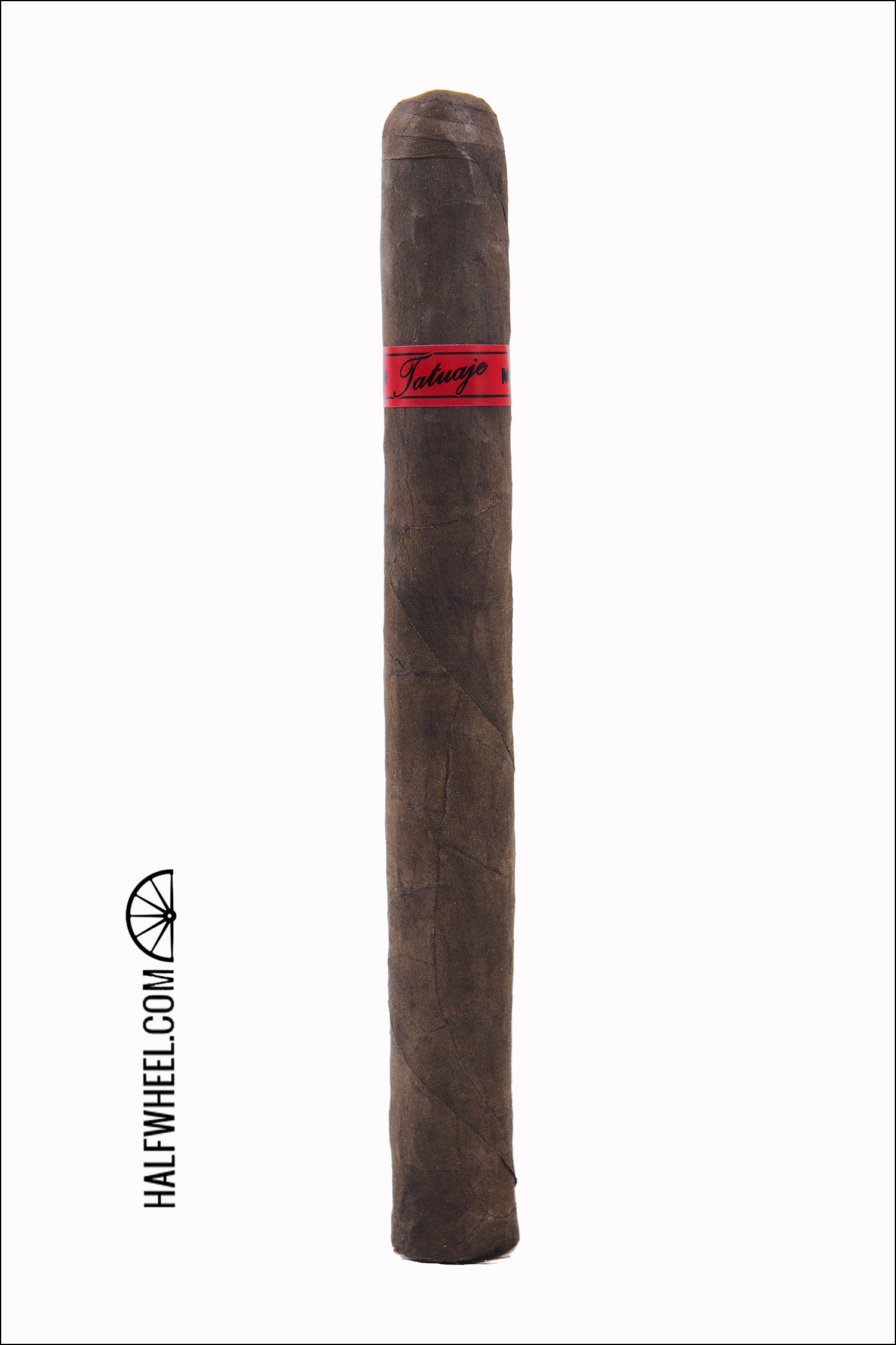
Inside, the cigars have a blood red band with black type and come wrapped in both blood red paper and ribbon, which really sets off the color scheme when seen as a whole. There is not a cigar that gets talked about more every year for its packaging than the Monster Series, releases like this show why. — BW.
3. CAMACHO LIBERTY 2013
With Camacho’s rebranding, the 2013 edition is the first Liberty Series to see major design changes to it.
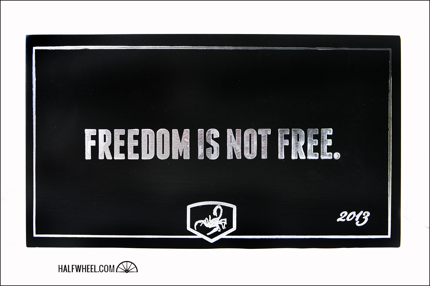
While the series has ranged from plain wooden boxes with just the name stamped on them all the way to intricate flags painted on each coffin, the 2013 edition conforms to the rest of the Camacho look. Like the Blackout, the top of the box doesn’t have any branding on it past the scorpion in silver, though the words “FREEDOM IS NOT FREE” and the year are included as well.
What sets the 2013 Liberty box apart from the Blackout box is that while the lid is the same lacquered black and silver, the bottom half is unpainted wood. Opening the box you see it’s almost built more like a humidor than just a normal cigar box, including beveled inserts creating a better seal and chrome side hinges with lid stays.
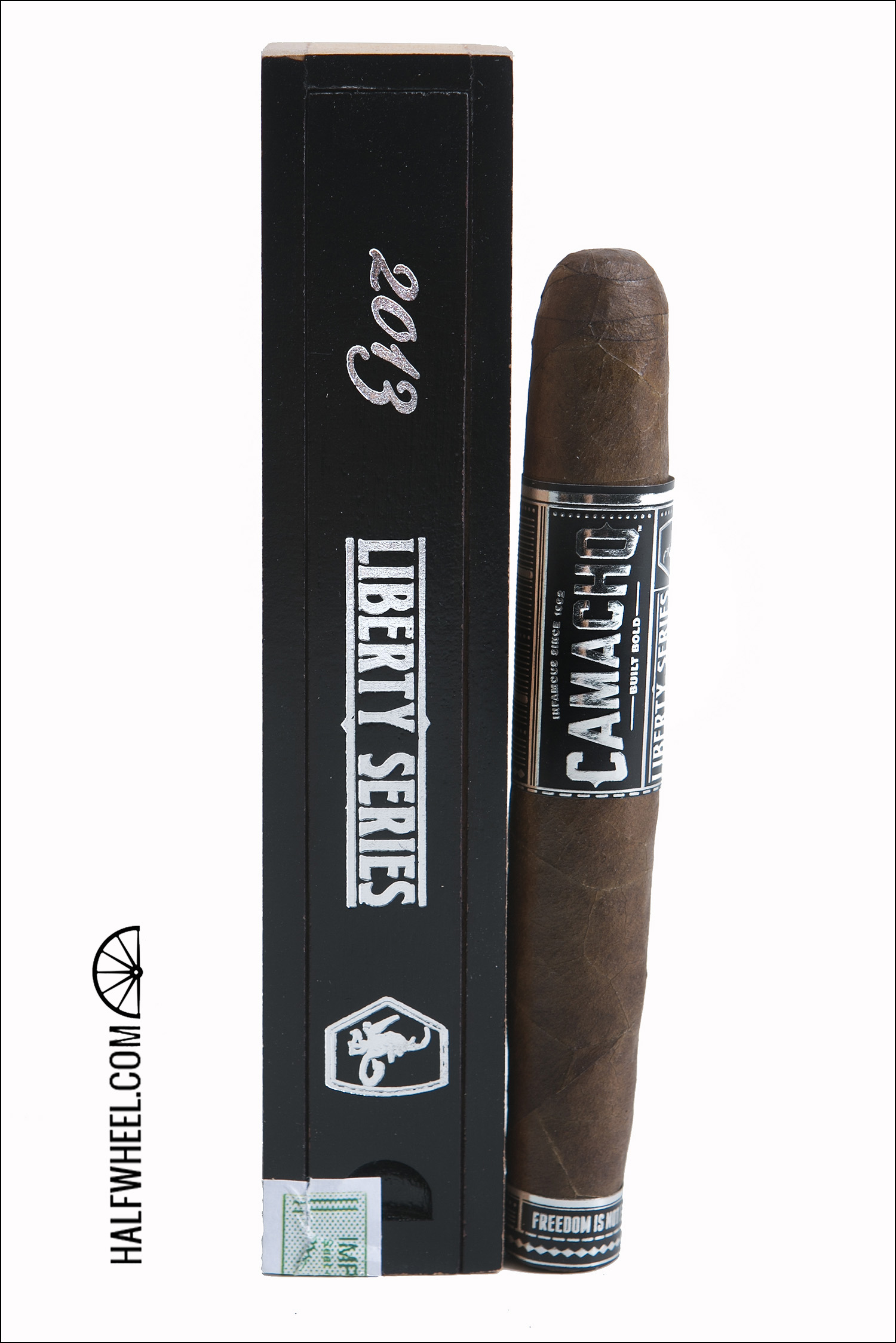
Displayed perfectly fitting in the box are of course the coffins, which each Liberty Series has been released in. The coffins continue the black and silver motif and are impressive even by themselves. While the cigar itself remains the same 11/18 perfecto size as its predecessors, the new, larger band matches the rest of the Camacho line up. — BB.
4. CAMACHO REDESIGN
There were quite a few cigar makers that looked at Camacho’s revamped line-up and wondered how the company was making money. The thick high-gloss boxes were one thing for a $10 limited edition, but for a $5.50 regular production item, it did not make sense.
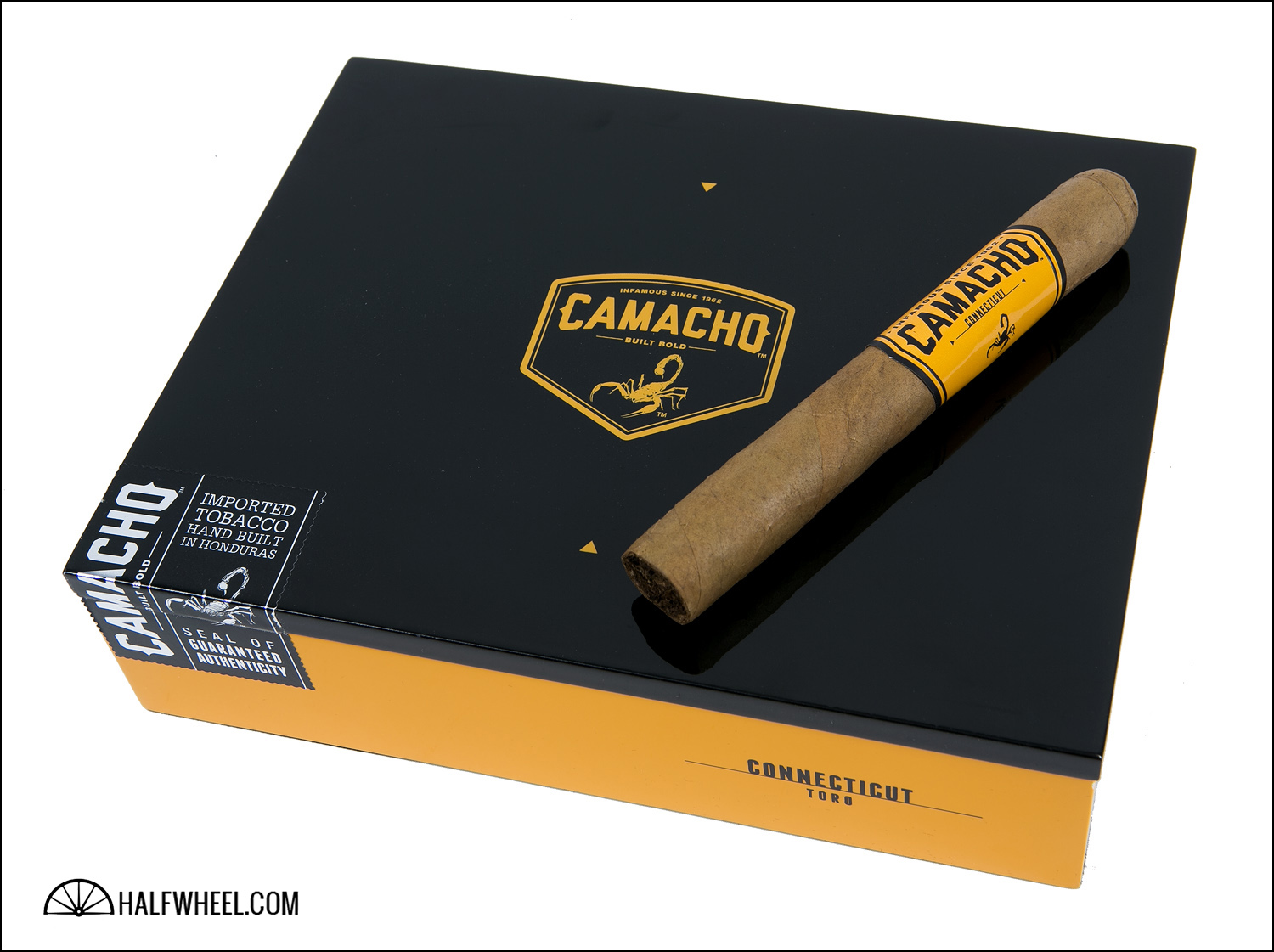
It must be stressed, what makes Camacho’s core packaging impressive is that it’s exactly that, regular production. While the Connecticut and Criollo lines might be confused in certain lighting, there’s zero confusing the new Camacho with the old. Bright colors, a contrasting black top, large bands and big letters.
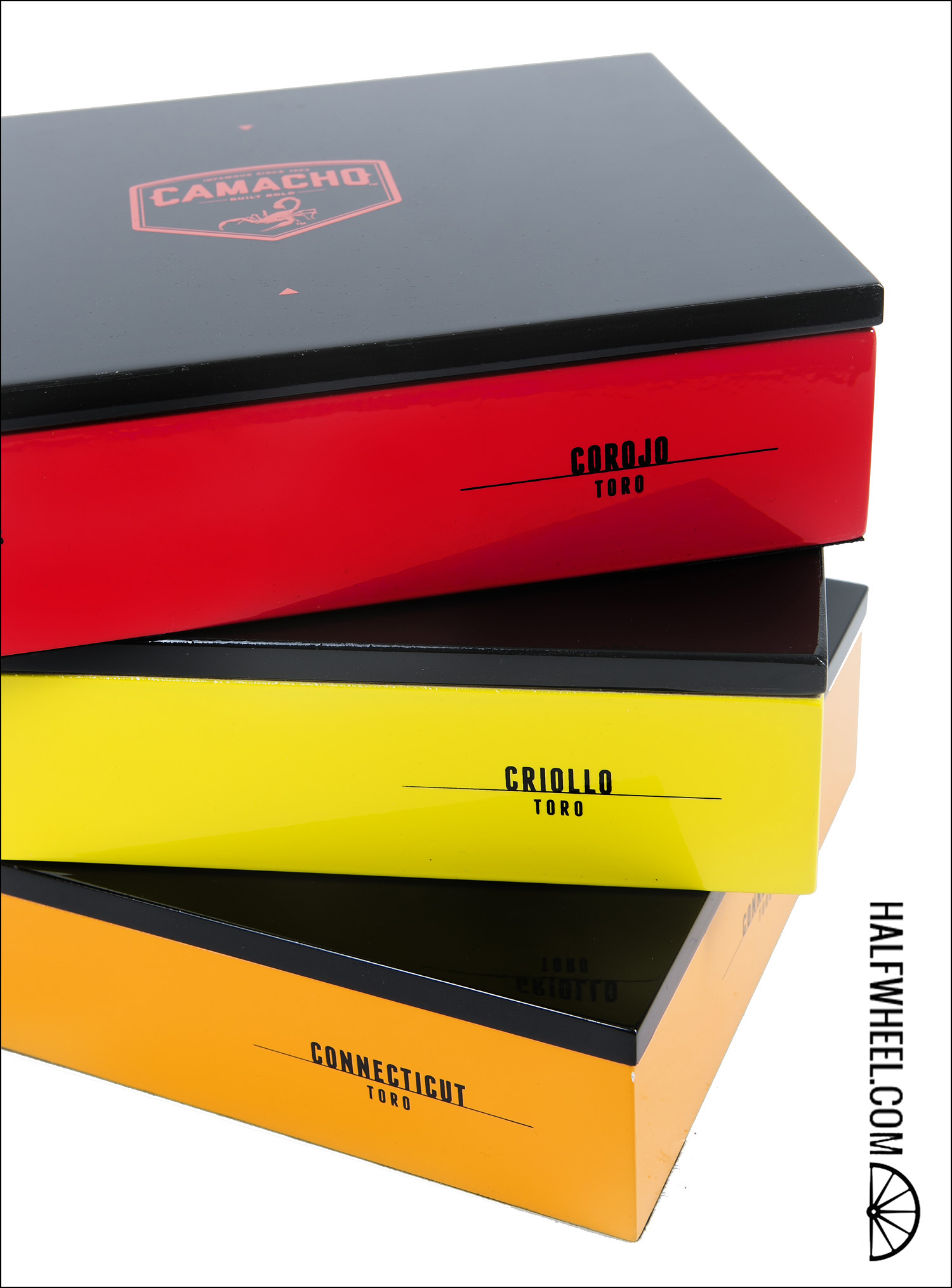
It has by no means been universally accepted, but it showed up in the top five of all but one of our packaging lists. — CM.
5. NESTOR MIRANDA 70TH ANNIVERSARY
The first time I saw the packaging for the Nestor Miranda 70th Anniversary, I literally stopped in my tracks and said to myself, “whoa, that is cool!”

Miami Cigar & Co. took a project and pushed its execution to the next level, designing packaging that encapsulated one of Nestor Miranda’s passions and turned it into something that resonated with consumers and created that “I gotta have one of those” reactions.
While the die-cast car made to resemble an A/C Shelby Cobra may not be the perfect long term storage solution, the Nestor Miranda 70th Anniversary scored points with all four of us for a number of reasons: first, there is no way this is going to end up in the trash or on the box heap in the corner of the humidor. Second, it appeals not just to cigar smokers, but to people who love cars—and the option of finding that perfect color added even further to its resonance with collectors. Top it off with high-quality bands that resemble highway signs and the total package was a winner.
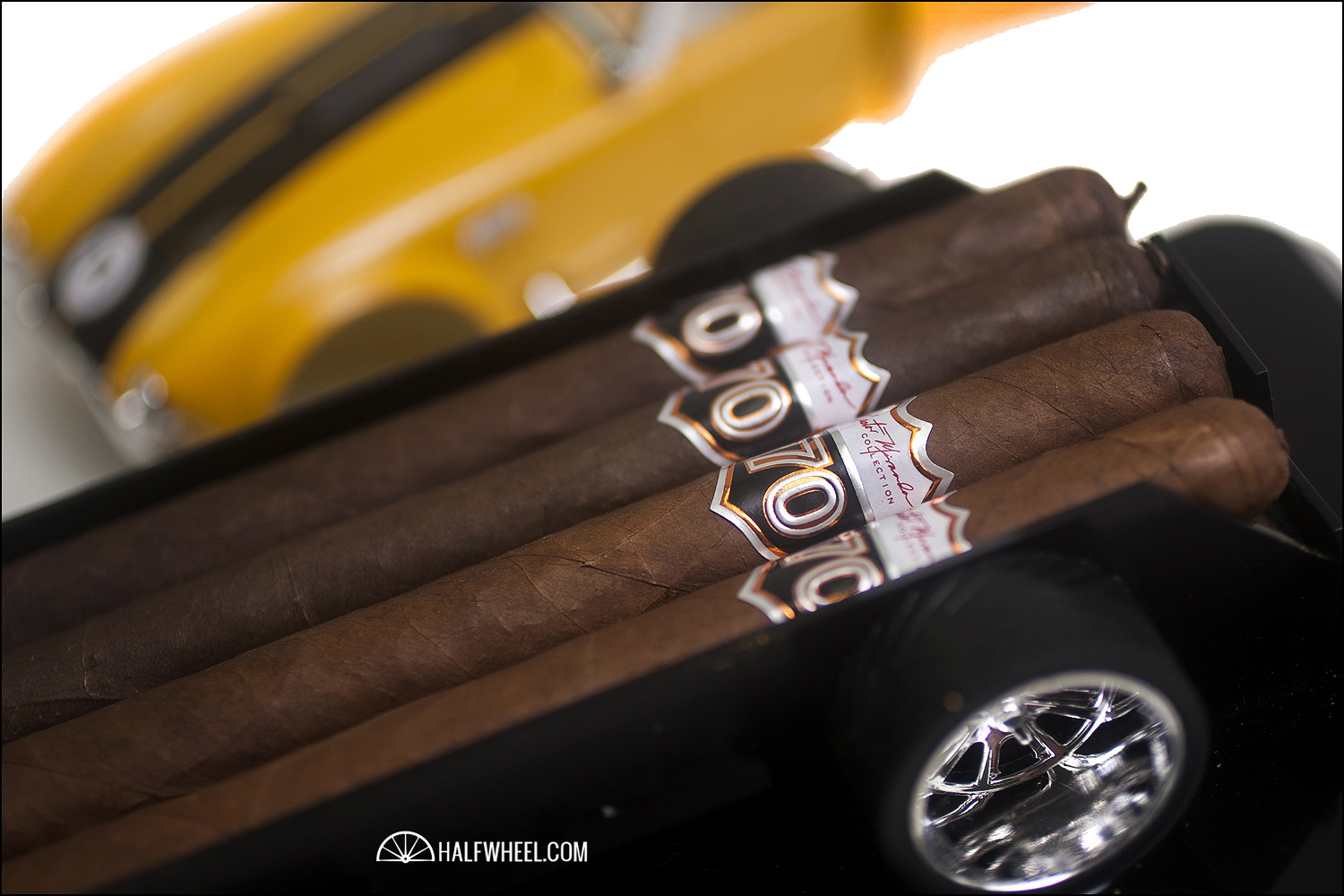
All you need now is a Nestor Miranda bobblehead next to it to complete the effect. — Patrick Lagreid.
6. FOUNDRY COMPOUNDS, ELEMENTS AND MUSINGS
I am not even sure where to start when it comes to General Cigar Co.’s Foundry Tobacco Company and its 21 new releases this year. There’s lot of packaging, some of it is not all that impressive, enough of it however is. War of Currents, one of two new releases was impressive, but it was not close to Compounds, Elements and Musings, a limited series with some of the largest and most ambitious packaging of the year.
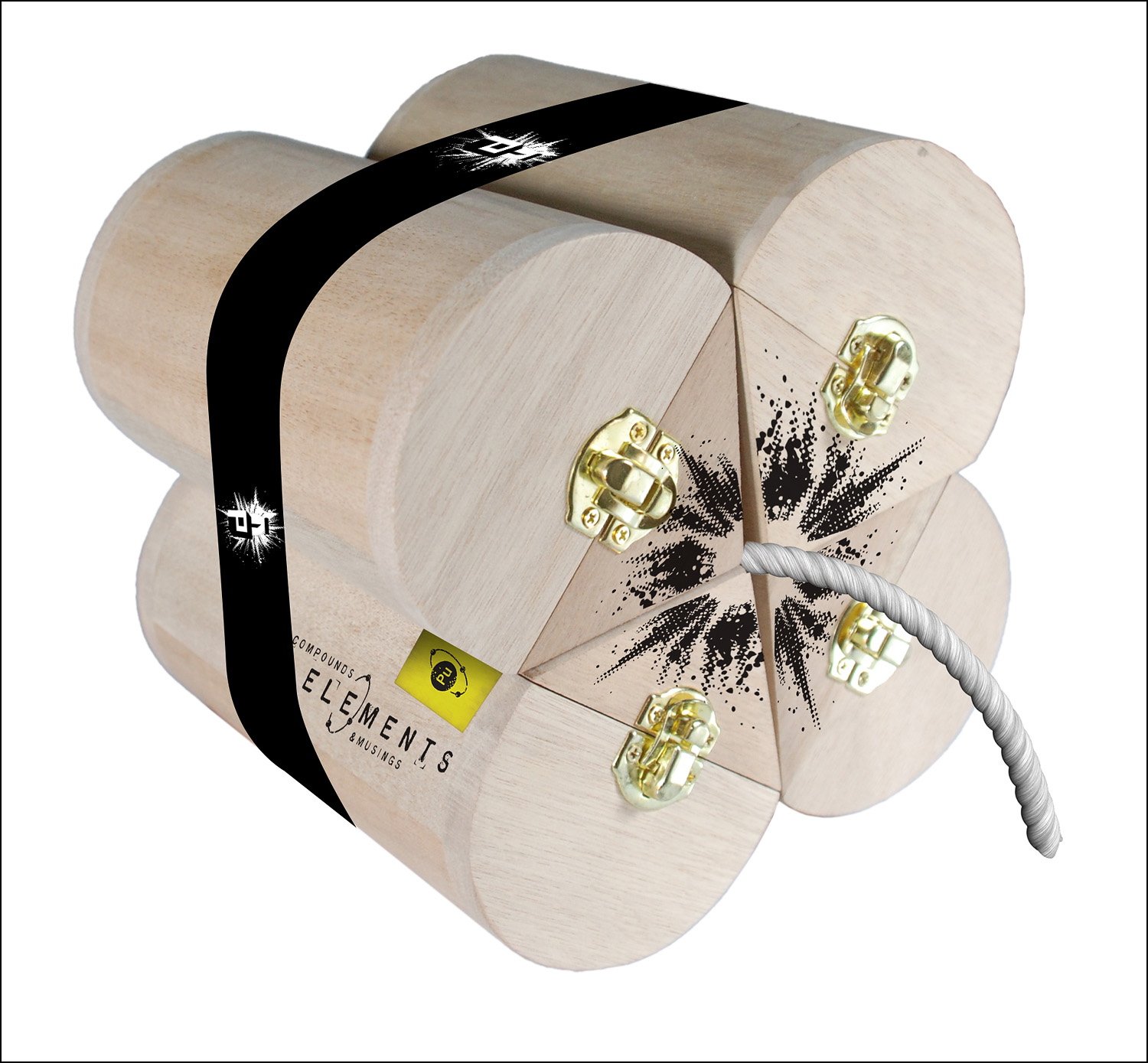
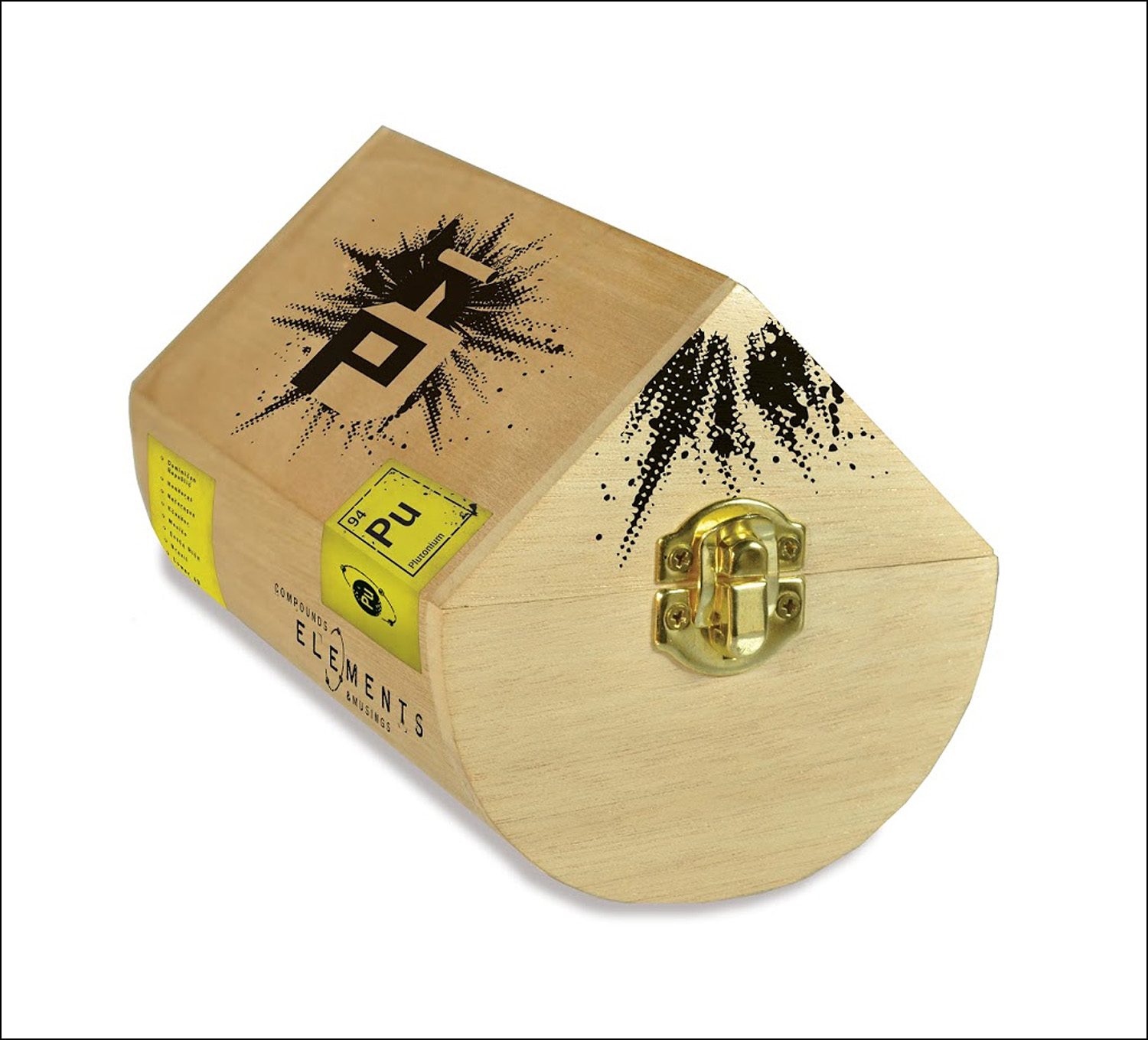
Amongst the most impressive is Plutonium, a set of four somewhat typical—at least for Foundry—boxes of 25 that combine to form a $600 image of a bomb, and a physically massive presence.
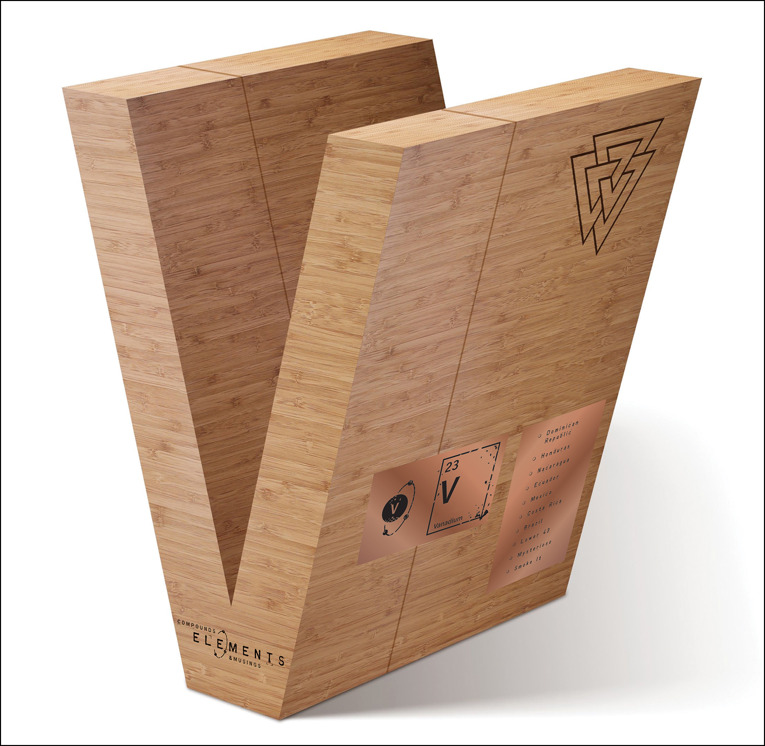
Then there is Vanadium, packaged in a 20-count box shaped literally like a flying v.
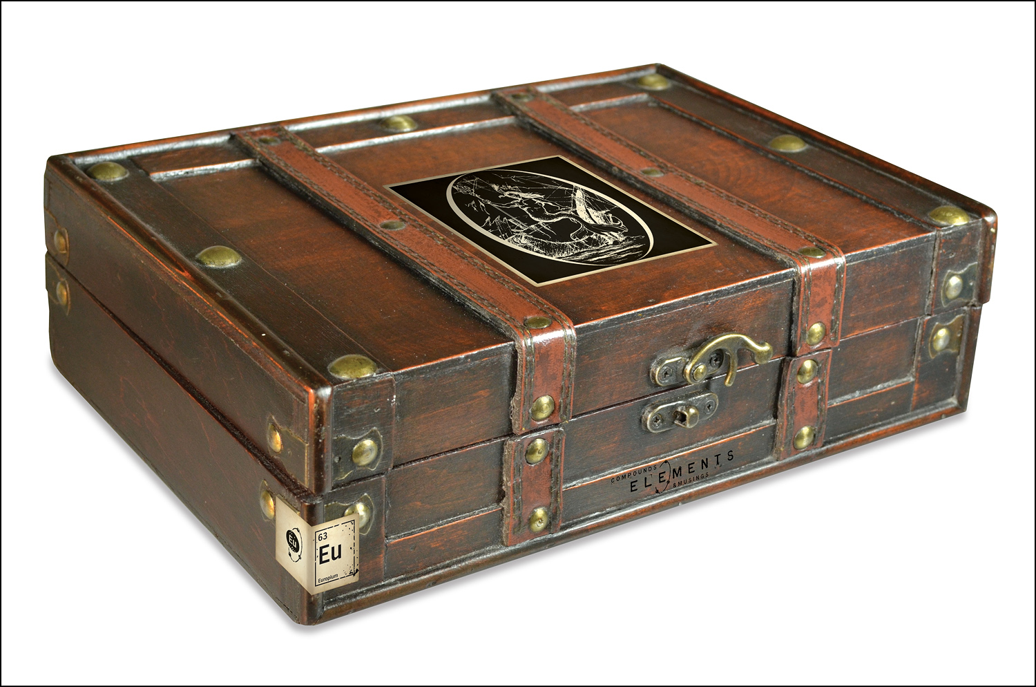
Europium is designed to look like a trunk, which it does featuring a worn out look and a heavy clasp.
Nothing Foundry did was typical. Some of it caused some head-scratching and the packaging might garner more attention than the cigars, but for the list, the place has been rightfully earned. — CM.
7. NICA RUSTICA
It would seem Drew Estate spends more time than a lot of other companies perfecting packaging for its cigar lines, many times it pays off.
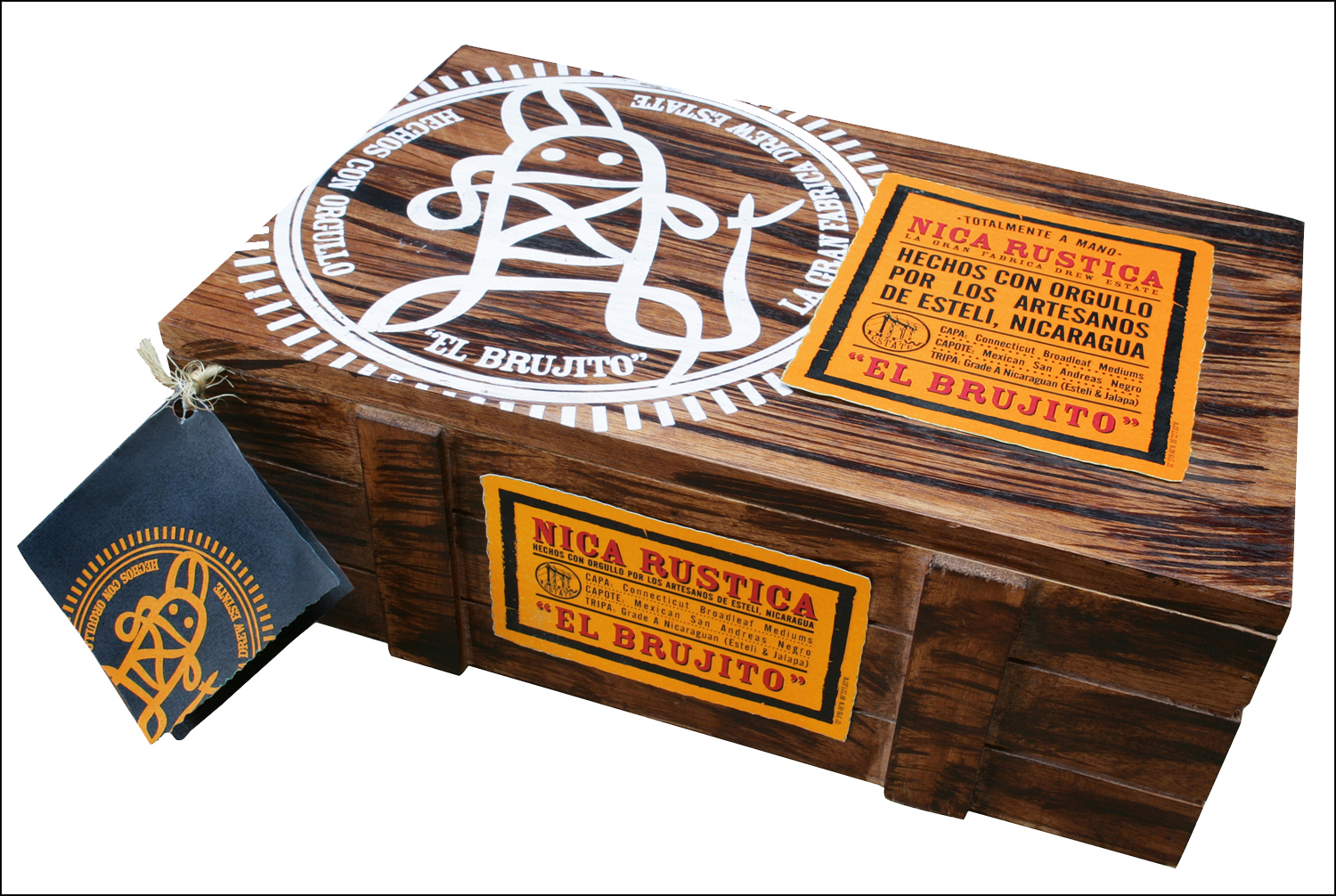
The cabinets for the Nica Rustica are extraordinary, made to look like wooden crates with two different compartments each holding a triangular bundle of 25 cigars. The logo that is used on both the outside of the box and the band of the cigar is that of el brujito, which translated means witch doctor or the shaman. The color scheme of woodish brown, canary yellow and red is distinctive without being overwhelming and truly make the cigar stand out in a crowd. — Brooks Whittington.
(Image via Drew Estate)
8. CRAFT 2013 LA CAMPAÑA DE PANAMÁ SOBERANA
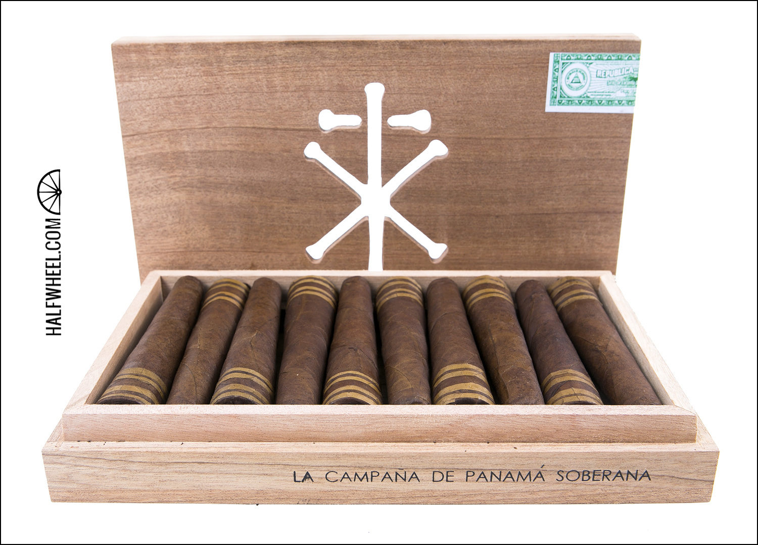
RoMa Craft Tobac has great packaging across the board, but the one that contains the CRAFT release supersede even those. The heavy boxes are made of solid wood with a bed for each bell-shaped cigar to lay cap to foot inside and with the CRAFT logo is actually hand cut out all the way through the lid so the cigars can be seen through the holes.
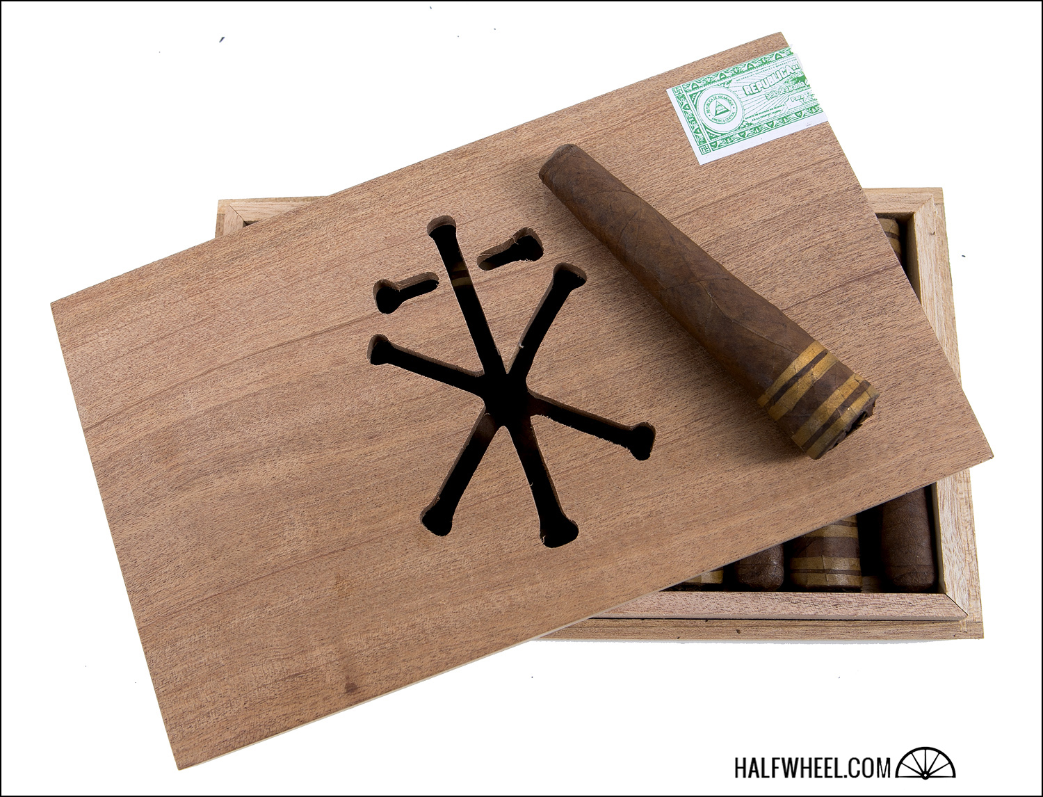
The appearance is deceptively simple, yet the hand-finished touches and the look of the cigars inside make the overall presentation stunning, and something that people will not be able to help noticing on a shelf. — Brooks Whittington.
9. CAMACHO BLACKOUT LIMITED EDITION 2013
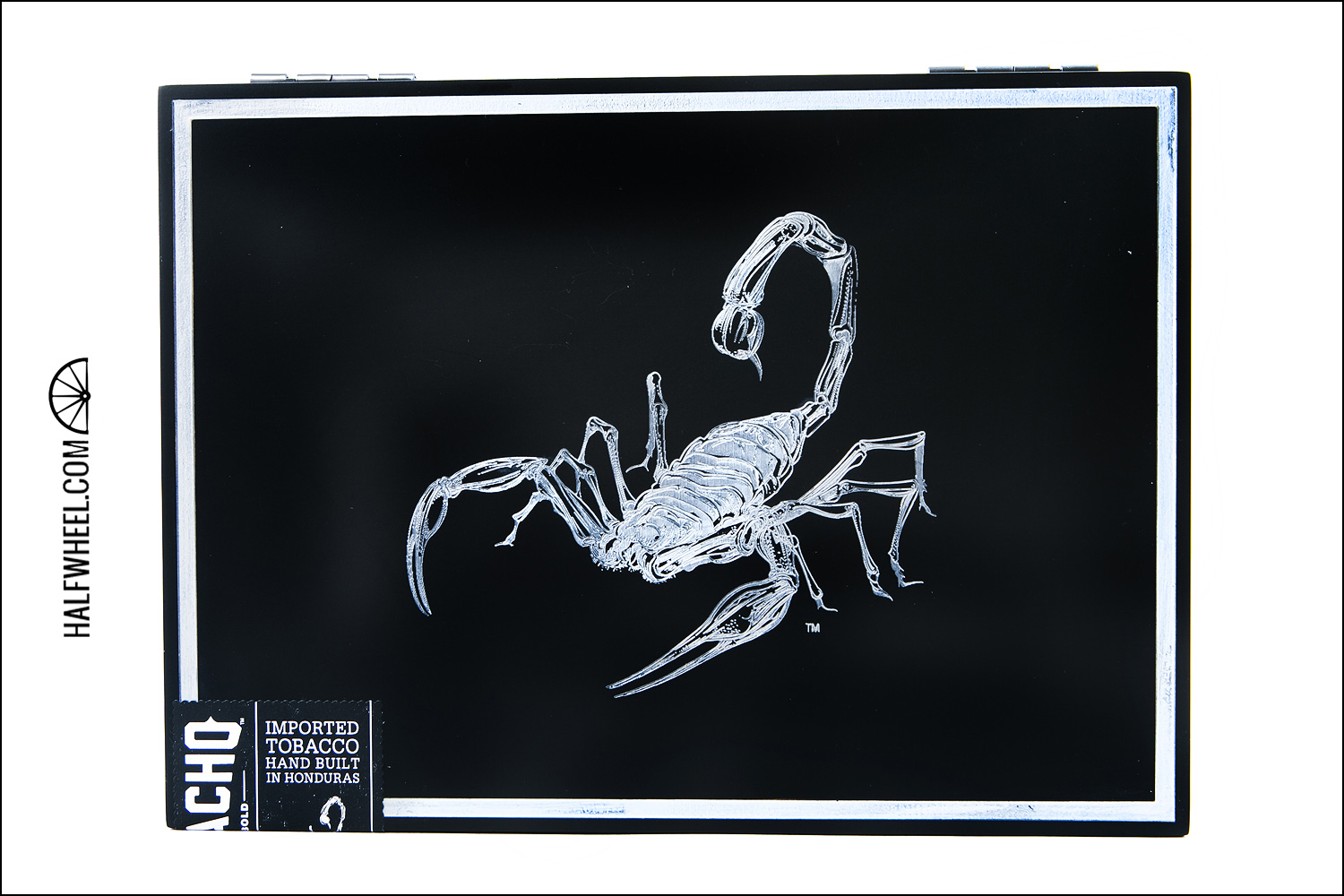
This past year was a big year for Camacho with their rebranding which included new limited editions and stunning new packaging. The Camacho Blackout is perhaps the most fitting box to have their scorpion on. Dominating the front in silver, the scorpion stands out beautifully against the black lacquer finish. Camacho relies on the scorpion as their logo with the brand name noticeably missing on the outside of the box.
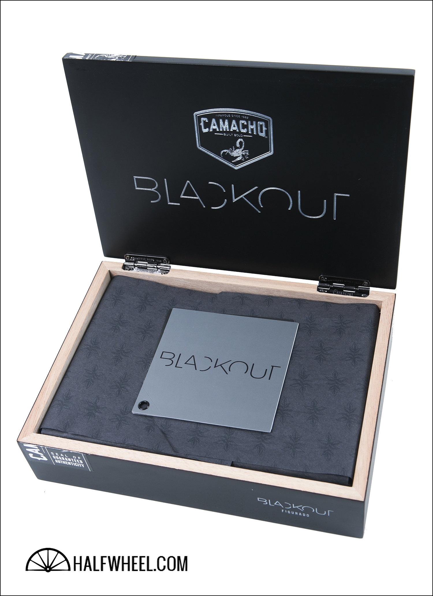
The minimalist design works well to keep the dark packaging stunning, impressive and slightly mysterious. The chrome hinges, the tissue paper surrounding the cigars and even the plastic inserts to present the cigars in a very precise position all scream of attention to the smallest design details. The bands and even the maduro wrapper play into the Blackout moniker.
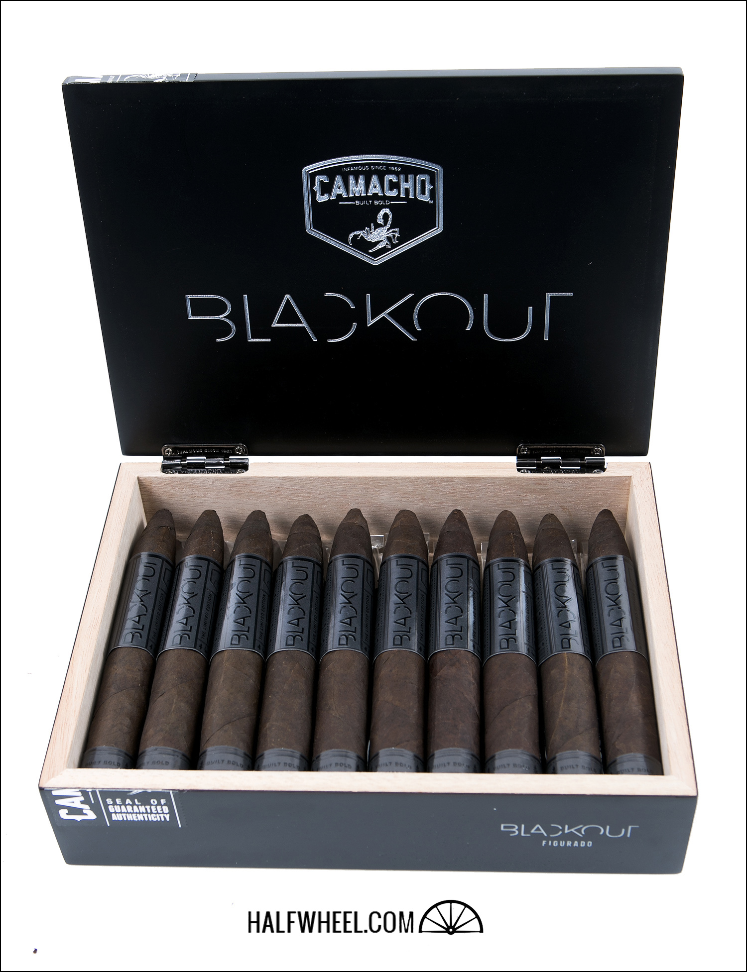
The choice to use black for everything on the band, including the text, makes the entire presentation a complete embodiment of the name. — BB
10. VIAJE DES II
Perhaps one of Viaje’s most anticipated releases in a while, the DES II is the follow up to the extremely well liked 2010 release of the Double Edge Sword.
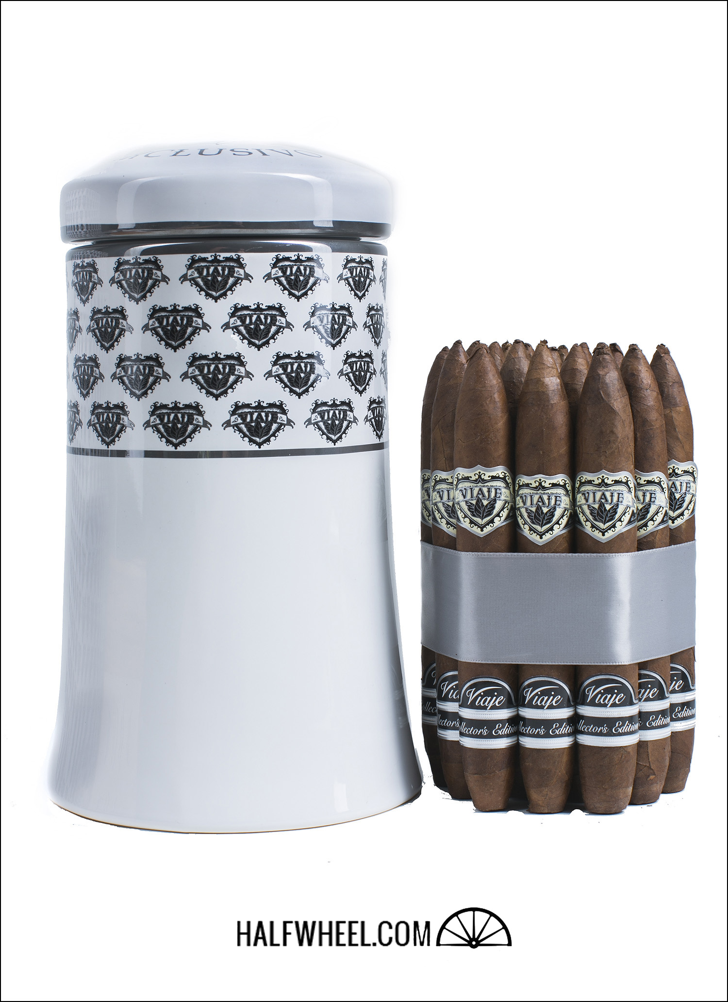
This time, the cigars were released in a beautiful ceramic jar instead of a box. There is much to like about the cigar’s design as a whole, but let’s start with the jar. Manufactured by the same company who makes the special release jars for Habanos S.A., it’s a stunning white with the Viaje logo patterned on the top half of the almost bell shaped jar. Off the top of my head I can’t think of a jar released that hasn’t looked great, but that doesn’t detract from the fact that ceramic glazed jars are impressive ways of packaging cigars.
Moving on to the bundle, the cigars are arranged in a uniformly even and eye pleasing wheel of 19 and wrapped in a wide silver ribbon. Though the original DES was the first time Viaje made the double torpedo shape, the DES II will be the fourth cigar they’ve released to use the shape, which I personally find appealing. The bands themselves are also works of art, using the normal cream, silver and black Exclusivo band though it features a secondary band on the foot setting it apart as a Collector’s Edition.
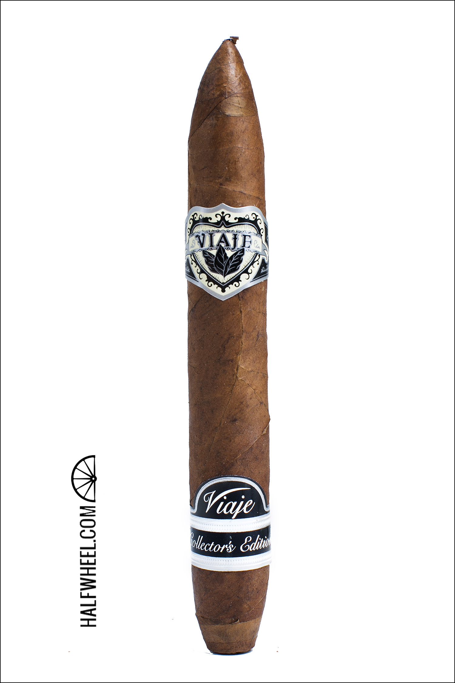
The one unfortunate thing for this release was that the jars seemed to have facilitated some damage to the feet of the cigars, with a large number of the cigars getting significant cracks along the first inch during shipping. Despite that the packaging overall remains quite a beautiful presentation. — Brian Burt.
For the top 10 packaging of 2012, click here.


